Dashboard Overview
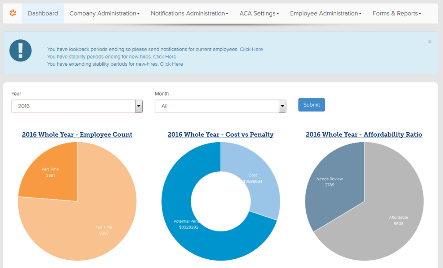
The Dashboard (pictured below) is meant to show a high-level picture of where the group is at for any given month based on hours entered and which employees are already being offered benefits. All of the graphs are clickable and show a list of the employees included in the totals shown with the exception of the Employer Cost piece of the Cost Vs Penalty graph.

Employee Count Graph
- If hours have been entered into the system, the Employee Count graph will reflect if an employee was deemed Full Time or Part Time depending on whether the hours entered for a particular month met the 130-hour ACA requirement.
Cost vs. Penalty
- The following pages illustrate how the potential penalties are calculated along with how the Employer Cost is determined.
Affordability Ratio
- All Full Time employees from the Employee Count are listed on the Affordability Ratio graph.
- Employees who are eligible for plans that cost them less than 9.66% of their monthly salary are listed as Affordable. Employees listed under Needs Review are those that are either not eligible for ANY plans despite their Full Time status, the plans they are eligible for cost more than 9.66% of their monthly salary and thus the plan is not considered to be Affordable, or the plan(s) the employee is eligible for does not meet Minimum Essential Coverage. Lastly, there could be some employees in the Needs Review section that are truly not eligible for an Affordable plan.
Download Dashboard Reports
- From the Dashboard, select the Desired Year and Month
- Click on one of the Pie Charts to view the corresponding reports
- Use the available filter tools to select appropriate search criteria
- Select Search (1) and then Download (2)
Updated less than a minute ago
